‘Telling the honest story’: How good data deepens understanding
Integrity earns trust. The work of a Monitor graphics designer is to inform, not to persuade. That means sifting for stats that can help readers make up their own minds about complex stories, and sharing them with clarity.
A clear presentation of quality data can make a complex story digestible. The right set of charts can be the basis of greater understanding.Ã˝
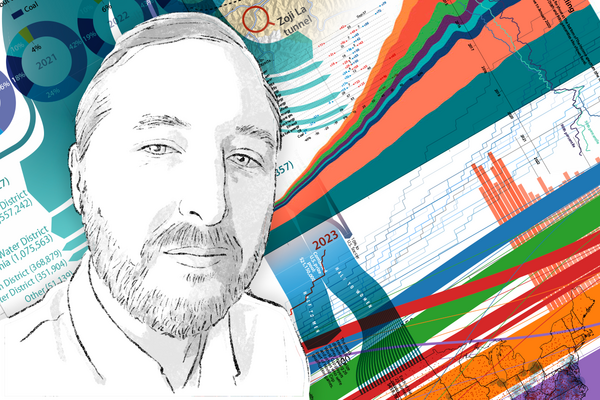
Data visualization calls for smart¬Ýdigging and artful displaying. Those are¬Ýtwo of Jake Turcotte‚Äôs main jobs at the Monitor.
‚ÄúLooking for good data is a process,‚Äù says Jake, a multimedia editor and director of graphics. ‚ÄúWhat we‚Äôre really looking for is primary source data. That is the gold standard for us.‚Äù That means mining the output of trusted institutions and sometimes casting a wider net. It demands care.Ã˝
“Sometimes data sources come with their own caveats,” Jake says on the Monitor’s “Why We Wrote This” podcast. “The people who put it together, you know, what’s their motive? Is it informing, or is it convincing?”
In telling honest stories, context matters. For example, “it’s become a popular idea that America’s cities are more and more dangerous,” Jake says. That’s supported by a five-year view. Zoom back, however, and you can see a decline from an early ’90s peak.
“What we’re trying to give readers is a toolbox that they can use to understand the world,” Jake says, “and to refute arguments that are made dishonestly.”
Show notes
Here‚Äôs a graphics-based story that Jake created in July on climate data and heat records:¬Ý
Here are two other stories discussed in this episode, on guns and on city murder rates:¬Ý
You can find links to all of Jake‚Äôs work on his staff bio page.Ã˝
Episode transcript
Clayton Collins: That‚Äôs the Monitor‚Äôs Jake Turcotte. You‚Äôll hear more about Jake in a minute.Ã˝
[MUSIC]
Collins: For smart news consumers, credible, well-sourced data can amount to unimpeachable “truth.” It can bring instant clarity, and fresh perspective, and “Aha!” moments. Of course, there have also long been ways of bending data to make a desired point: Use percentages instead of low unit numbers, for example, and you can present a technically accurate data set that’s also fairly meaningless. And today, in what’s been called the era of post-truth and of misinformation and disinformation, honest data visualization has an especially important role in journalism.
[MUSIC]
Collins: This is “Why We Wrote This.” I’m Clay Collins. Joining me today is Jake Turcotte, a multimedia editor, artist, and designer who regularly creates monitor graphics and data visualizations. Welcome, Jake.
Turcotte: ‚ÄäThanks for having me.
Collins: Jake, what’s your standard for good data visualization, and where do you get your data?
Turcotte: ‚ÄäSo I think a good data story can really draw a reader in. It can distill something complex into something digestible, but also have more depth to explore.
Looking for good data is a process. It‚Äôs a lot of Googling. But what we‚Äôre really looking for is primary-source data. That is the gold standard for us. When we‚Äôre looking for information about U.S. populations, we look to the Census. On other issues you‚Äôll have to cast a wider net. And sometimes data sources come with their own caveats. The people who put it together, you know, what‚Äôs their motive? Is it informing or is it convincing? People might cherry pick data. People might color your perception by using ‚Ķ color. You know, we [often] interpret red as maybe a negative or a dangerous color, and blue as safe or good.Ã˝¬Ý
The other most important thing we‚Äôre considering is how we‚Äôre using the data that we find. Just as in writing, there are a million ways to characterize the facts that you find. Context is key. I think about a story that we found via a press release some years ago about the Chesapeake Bay. The water quality was improving. As we looked into it further, it turns out that, yes, it did improve in the past year, but it‚Äôs been on this steady decline for the last 20 or 30 years. Another great example is, you know, it‚Äôs become a popular idea that America‚Äôs cities are more and more dangerous. And it‚Äôs true if you zoom out to the past five years, you can see a spike in violent crime in American cities. But that‚Äôs not the whole story. If you zoom out further, beyond the ‚Äô90s, into the ‚Äô80s, you can see that crime in American cities is way down from its peak in the early ‚Äô90s. We need to make sure that we‚Äôre telling the honest story and not trying to hide in the details of the charts, [or] some sort of agenda.Ã˝
Collins: So, Jake, you’re a creative artist. I mean, are you able to find joy in the presentation of data? In what ways is it a joyful, creative outlet?
Turcotte:  I think about the story we did last year about a wildfire in the Florida Panhandle and, its relationship to Hurricane Michael. So I went searching for some data about hurricane Michael’s 2018 storm path and the location of the fire and the spread of the fire. And when I put the two datasets together, it was just perfect. It showed that this area where all these trees had been knocked down was exactly where this wildfire happened. And it was directly in the eye of the storm. It’s just a really happy thing when you have a theory about “if we look for this and we look for that and we put them together, will it tell its story on its own?” And when that happens, it just feels great.
Collins: That‚Äôs great. I‚Äôm thinking of some specific examples of really striking data presentations by you. And they feel irrefutable because of everything you said about the source data. There was one around mass shootings that showed a really clear drop in those shootings during the years of the U.S. assault rifle ban. But of course, facts today sometimes get refuted and denied when they don‚Äôt fit narratives. So I‚Äôm wondering are you hopeful that what you‚Äôre doing is going to land, and make a difference?¬Ý
Turcotte:  We receive feedback on our work all the time, from every corner of the ideological spectrum. Spectrums don’t have corners, do they?
Collins: [Laughs.]
Turcotte: Not everybody‚Äôs convinced, obviously, that things are true or factual. We are surrounded by misinformation, maliciously produced oftentimes. What we‚Äôre trying to give readers is a toolbox that they can use to understand the world, and to refute arguments that are made dishonestly.Ã˝
Collins: Mm-hm.Ã˝
Turcotte: ‚ÄäWe‚Äôre not trying to convince anybody of anything. We‚Äôre trying to show them to the best of our ability, the facts as we can best understand them.Ã˝
Collins: You say “for us,” and that brings me to the Monitor lens. As a news organization, we aim to provide calming context, but sometimes data presents a picture that’s stark or downright scary. This came up around your recent package about searing heat. There was a really red global map, and rightfully so. How do you reconcile that? What are the special guidelines to which you adhere as a Monitor journalist trying to add light to stories?
Turcotte: ‚ÄäA lot of data is scary. And just as in news stories, the world can be a confusing place. But we always try to look for pieces of hope in the news. One form that we often use in these stories is to bundle charts together, and try and tell a full story by juxtaposing different pieces of the problem and possible solution. We often will conclude a chart series with a look toward the future: What would a solution to this issue look like? Who‚Äôs trying to solve this problem now? So one obvious example is the climate stories, and how can we reach this goal of limiting warming to a degree and a half or two degrees? And there‚Äôs not always a solution ‚Äì a clear solution. But we have the opportunity to give readers some kind of hope, or even an idea of how they can contribute to a solution.Ã˝
Collins: You have a lot of go-to tools that you use in the creation of graphics. I’m wondering how you think emerging technology like generative AI will come into play. Does it have a role as a shortcut to good data amid all the dross? Or does it just mean you’ve got more garbage to sift?
Turcotte:  I’m personally wary of trusting anything that any of these chat bots or search helpers say. I think that factually, it’s easy to prove them wrong often. But on the other hand, when it comes to finding data, something like a search assistant can help you find original primary sources, documents prepared by human beings that include numbers you’re looking for. So there actually is some time-saving involved there.
The other part of that is we‚Äôre writing for human beings. News that ... people can understand the world if they read it. And we‚Äôre trying to provide hope. And none of these AI tools are have people‚Äôs understanding in mind, or as a goal.Ã˝
Collins: Thank you, Jake, for the work that you do every day for the Monitor, and for coming in here to talk about it today.
Turcotte: ‚ÄäSure. Thank you for having me.Ã˝
[MUSIC]
Collins: ‚ÄäTo our listeners, thanks for being here. You can find the show notes with links to Jake‚Äôs work at CSMonitor.com/WhyWeWroteThis. This episode was hosted by me, Clay Collins, and produced by Jingnan Peng and Mackenzie Farkus. Our sound engineers were Tim Malone and Alyssa Britton, with original music by Noel Flatt. Please take a moment to rate and review us wherever you listen to podcasts. Produced by the ∫£Ω«¥Û…Ò Science Monitor. Copyright 2023.


