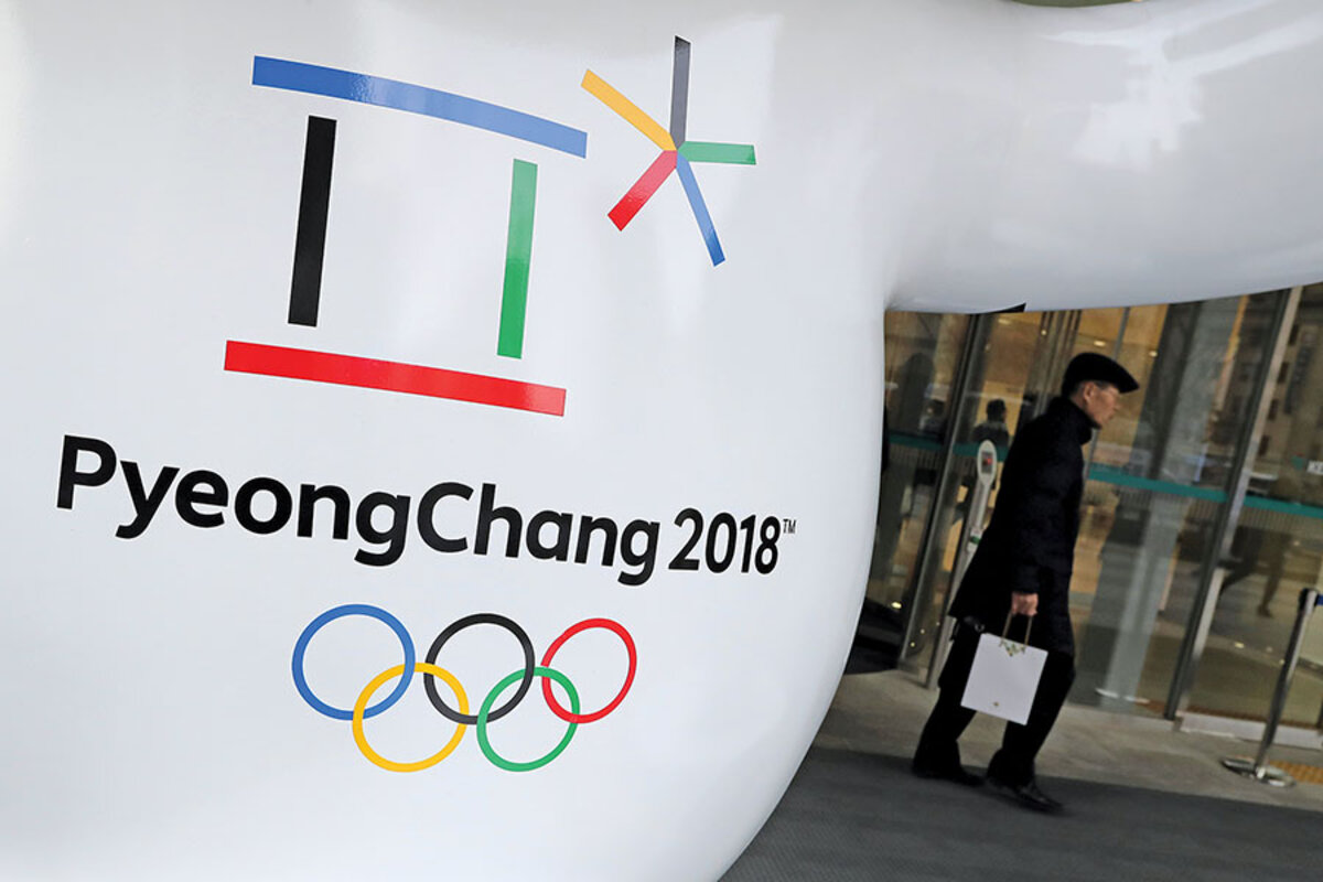
The story behind the 2018 Winter Olympics emblem
Loading...
Every two years, as millions of viewers worldwide tune into the Olympics, there is one image that they see over and again: the Olympics emblem designed especially for those Games.
How can a single image encapsulate so huge an event? In recent years, there have been a variety of answers to that question: connected figures for the 2016 Summer Olympics in Rio de Janeiro; a thick blue font for the 2014 Winter Olympics in Sochi, Russia; and blocky, jagged shapes for the 2012 Summer Olympics in London.
For this year’s Winter Olympics in Pyeongchang, South Korea, designer Ha Jong-joo opted for a design inspired by the Korean alphabet (Hangul) and the concept of “cheon-ji-in,” or humanism, in Korea. The five colors seen on the Olympic rings are used in different aspects of Korean culture, allowing the Pyeongchang emblem to “riff ... off” of the original Olympic rings but also maintain a close connection to Korean culture, says Scott W. Santoro, a professor at New York’s Pratt Institute. As a global audience learns what the emblem suggests to Koreans, he says, the hope is that it will also speak to them.
An Olympics emblem needs to work in several ways, says John Caserta, an associate professor in graphic design at the Rhode Island School of Design. “It does need to have some sense of sports and flair and excitement...,” he says. “You want to try to embed the values, the best part of it in there.” And how we consume media also plays a part in today’s design, Professor Caserta notes. “I think the fact that screens are everywhere and everything’s moving is ... kind of a 2018 phenomena, or at least a 21st-century phenomena,” he says.
Was there an Olympics emblem that worked particularly well? Caserta and Mr. Santoro both point to the one for the 1968 Summer Olympics in Mexico City. “The 20th century was sort of the heyday, I think, of the Olympics identity systems,” Caserta says.


