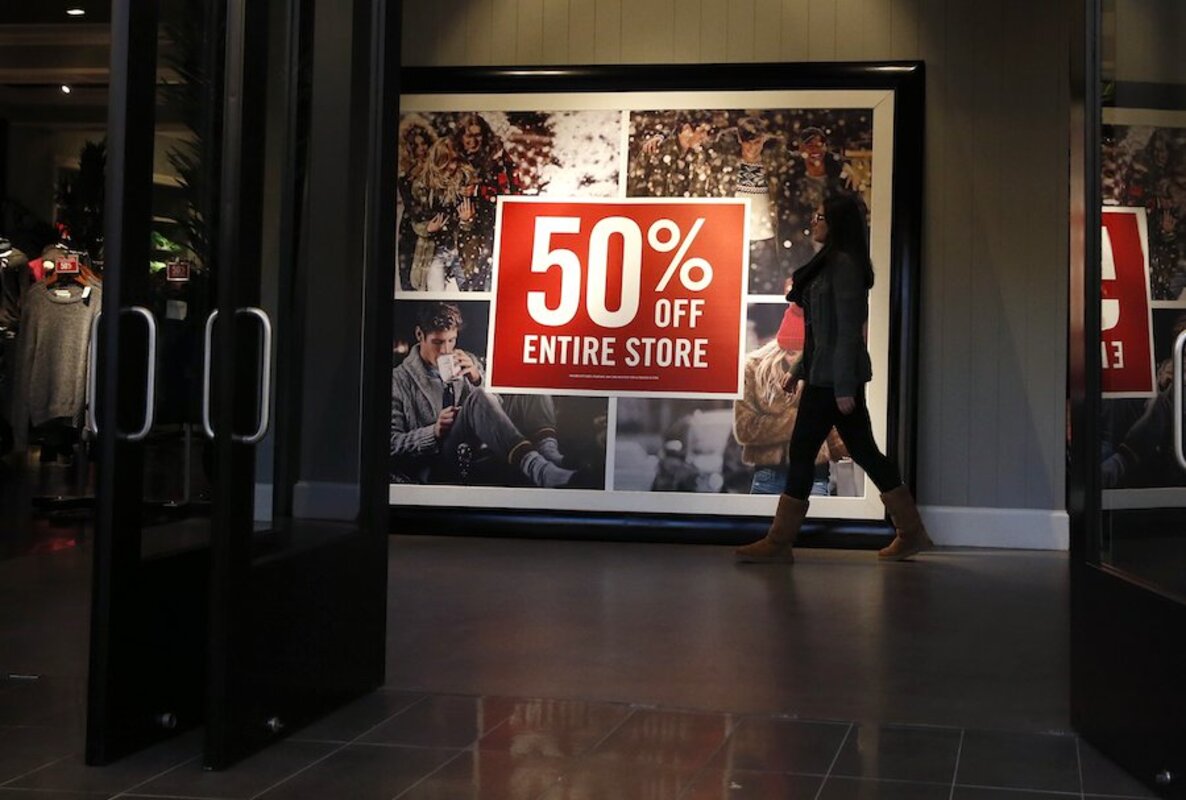
Abercrombie & Fitch gets a sophisticated new look. Does it work?
Loading...
Abercrombie & Fitch has been struggling for awhile now, as its main demographic of mall-roaming teenagers has become more interested in other brands (like , supposedly). Abercrombie has thus been trying to expand its appeal and find a wider audience of shoppers.
These efforts have resulted in a branding shift; Abercrombie is now aiming to be more of a , while sister store Hollister aims to grab the teens and "fast fashion" market.
So how will that affect the clothes?
One of the most obvious changes is that Abercrombie is putting its logo on fewer items.
In the past, the brand would slap its name all over sweats and T-shirts, but supposedly that won't be so prominent going forward — or so they say. We still found a , but the store's advertising is definitely light on logos.
Another noteworthy change? No more naked models in Abercrombie's ads, and no more shirtless guys standing at the entrance to their stores.
As the , the store is "shedding its abs image." If you were someone who actually enjoyed this stalwart of suburban shopping centers, then consider taking a moment to say goodbye to these guys, .
The result of these changes is a line of clothing and ads that Business Insider describes as . That site has additional images of the .
Readers, what do you think of Abercrombie's new look? Are the clothes more adult, or are they too dull?
This article first appeared in


